Sunflower Coloring Pages
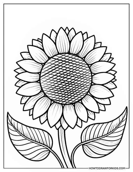
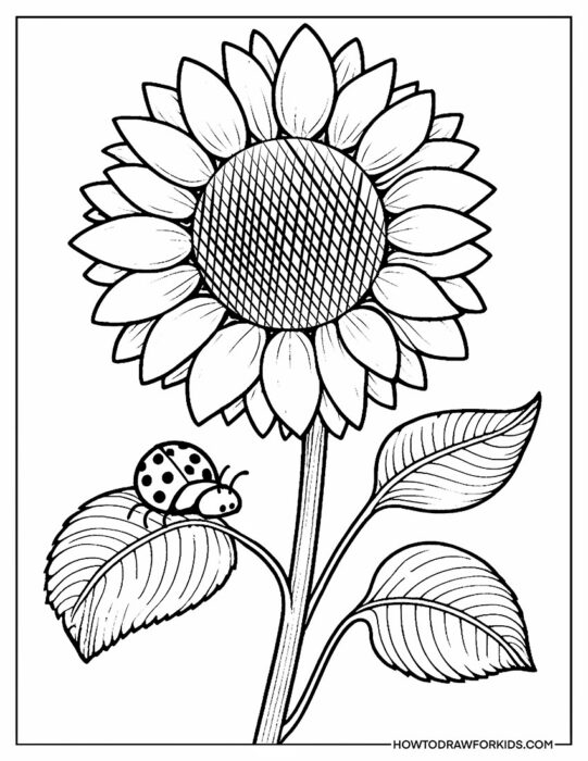
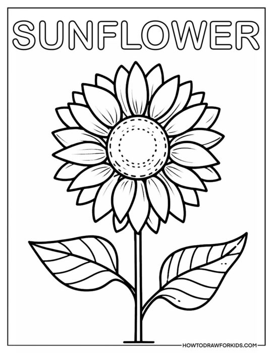
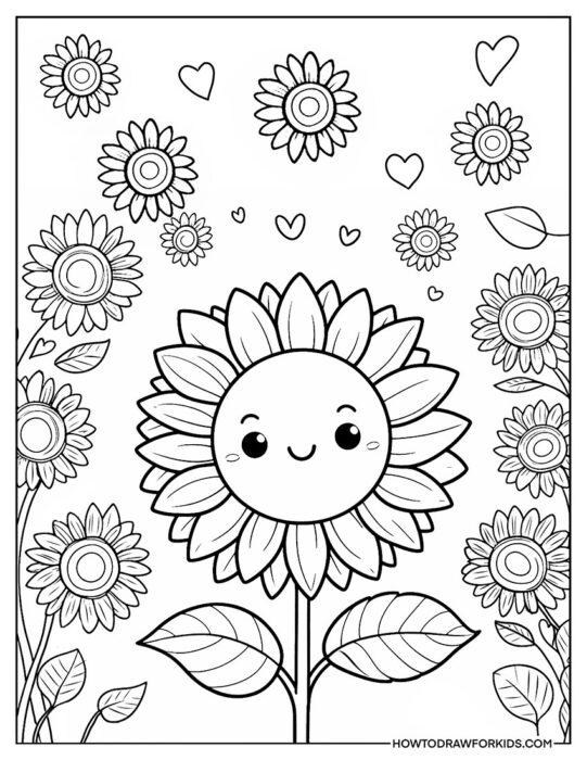
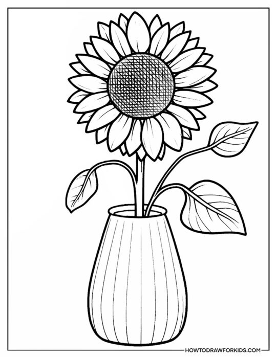
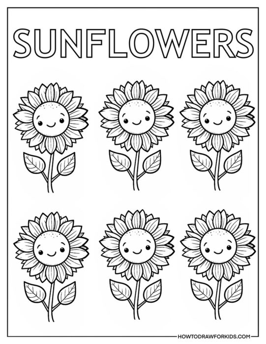
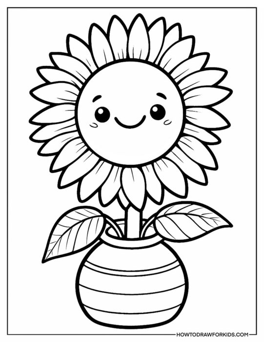
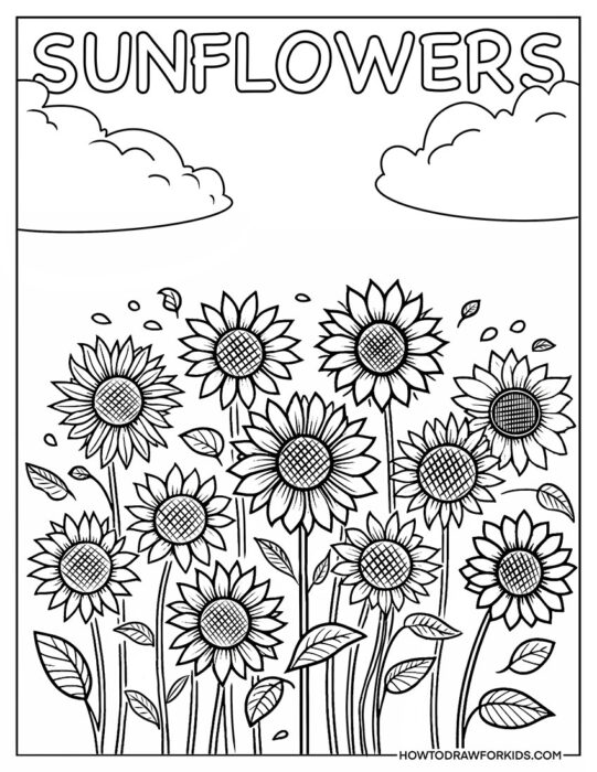
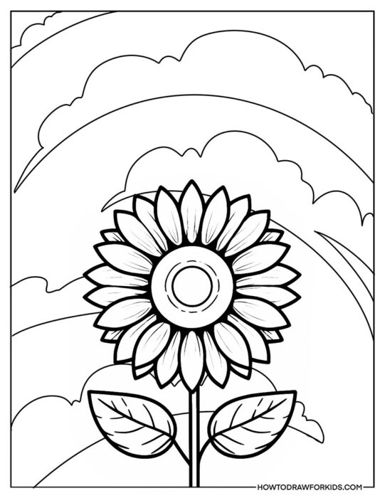
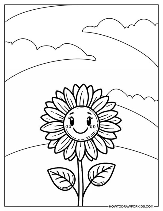
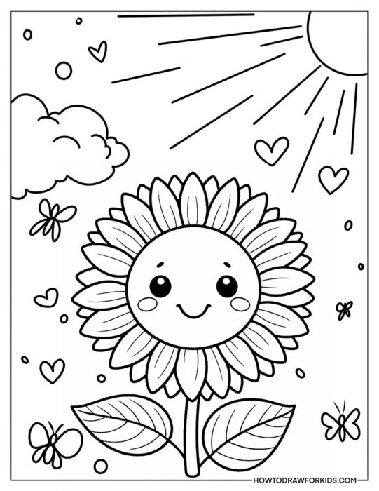
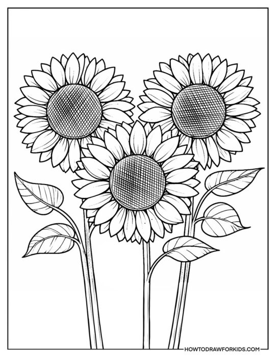
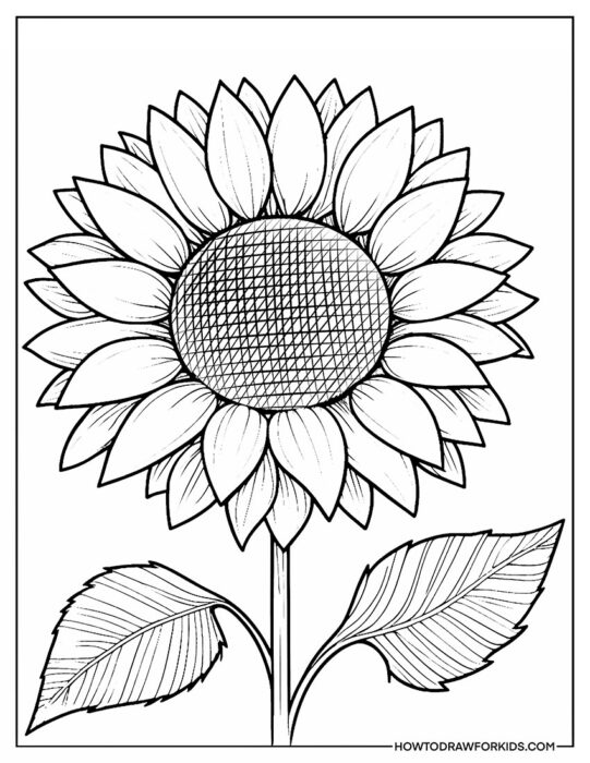
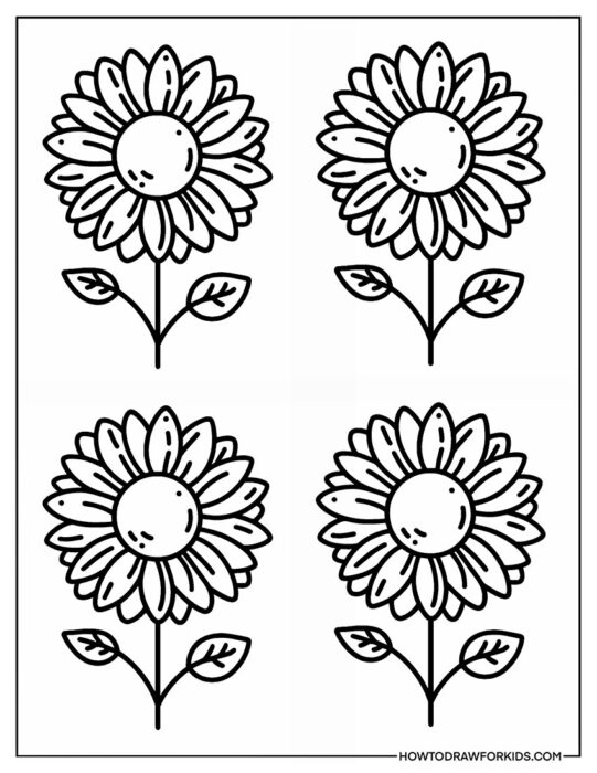
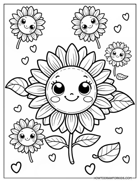
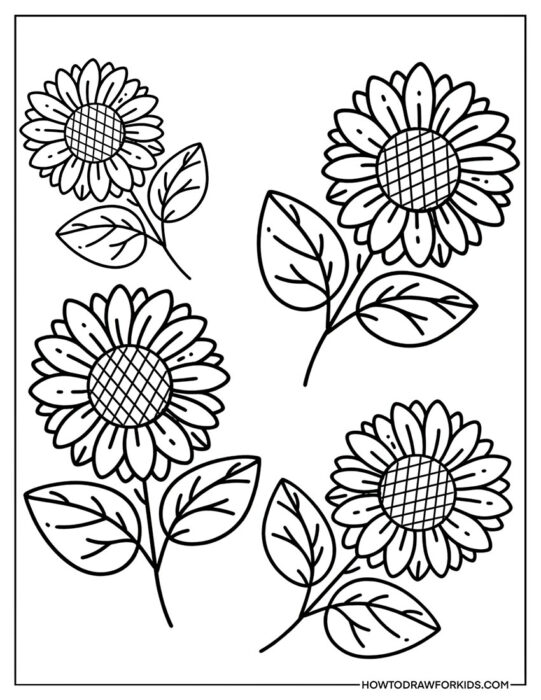
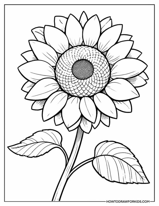
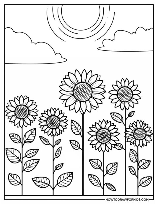
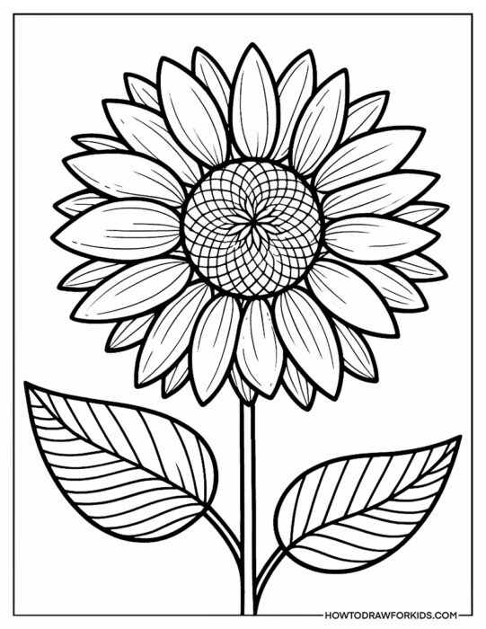
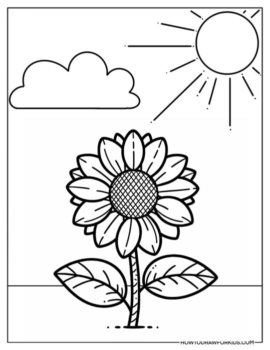
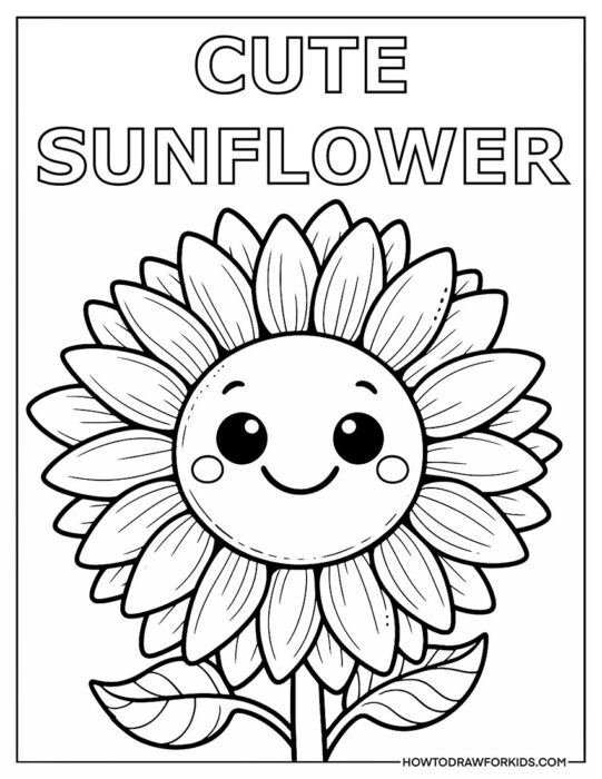
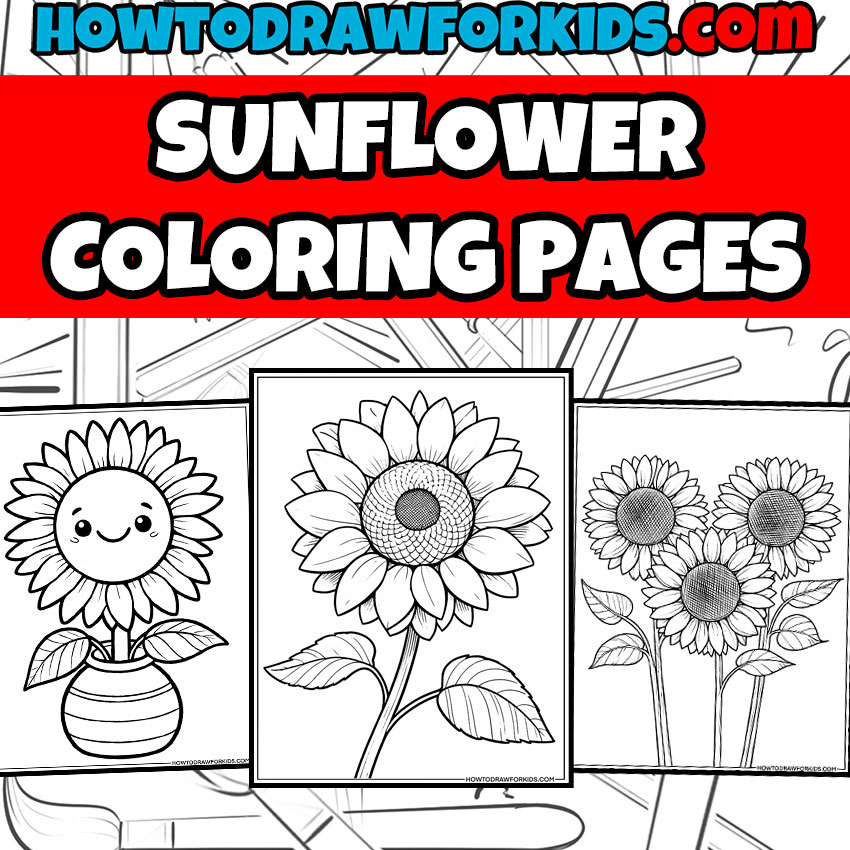
Download my free sunflower coloring pages with different designs. Experiment with yellows and greens to improve your paining skills.
Sunflower Coloring Pages: Introduction
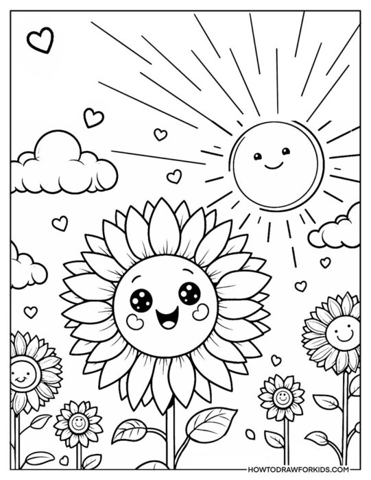
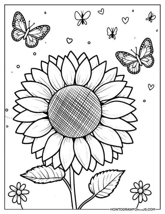
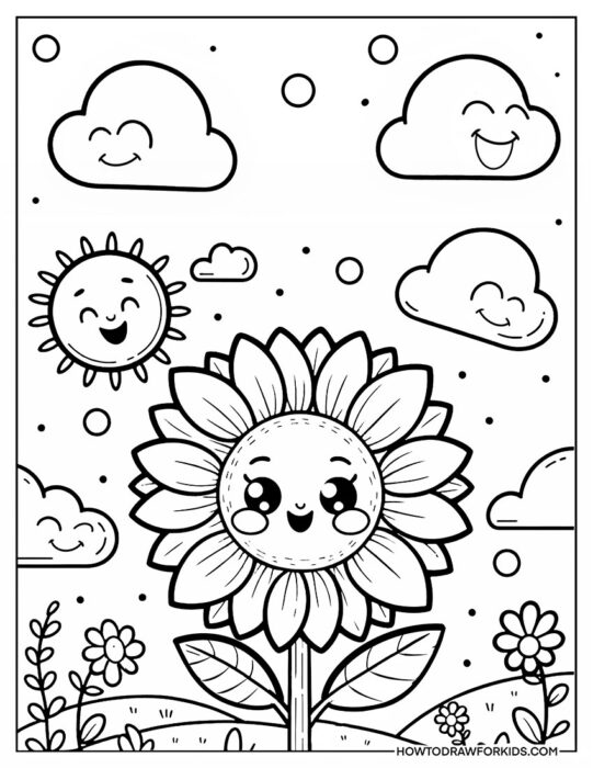
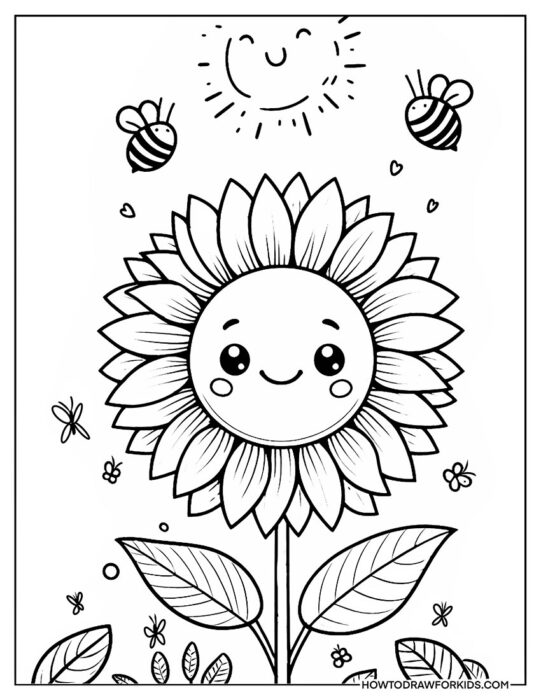
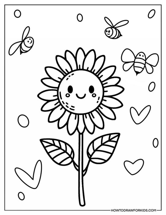
I’m pleased to share my sunflower coloring pages, featuring a variety of scenes from cute sunflowers to vibrant ones with butterflies and bees. These pages allow you to train your coloring and drawing skills.
When coloring sunflowers, use a mix of yellows, greens, browns, and blues. Bright yellows work well for petals, while darker greens and browns can add realism to leaves and stems, creating a more natural look.
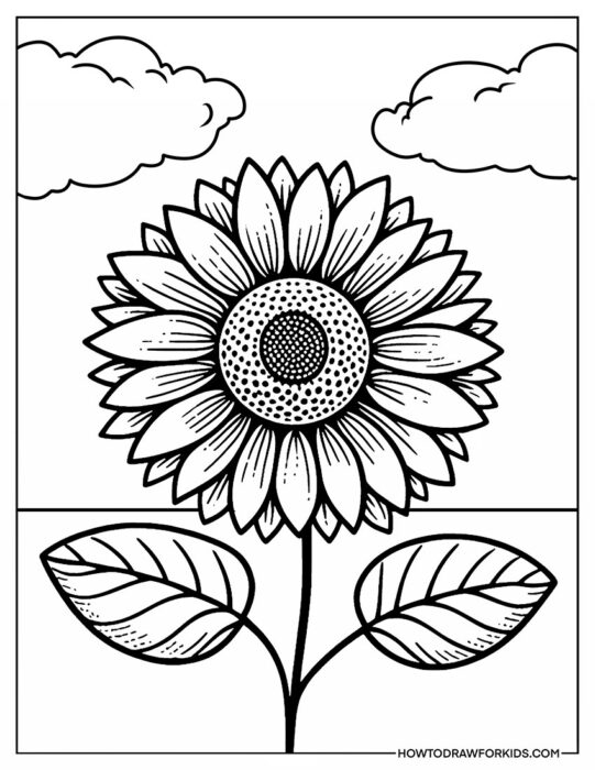
It’s important for beginners to focus on the light source in their coloring, especially in scenes with sunflowers under the sun and clouds. Understanding where light and shadows fall will help you apply lighter and darker shades effectively, giving the flowers a more three-dimensional appearance.
In scenes with butterflies and bees, adding small details can make the artwork more interesting. Use fine tips or sharpened pencils for these tiny elements to keep them clear and detailed, improving the interaction between the flowers and creatures.
Experimenting with blending and layering techniques can also improve your sunflower scenes. Mixing different yellows and greens creates a more lifelike look, making the sunflower scenes feel more realistic.
Sunflower Coloring Pages
Download All Sunflower Coloring Pages
In addition to individual sunflower coloring pages, I’ve compiled all the pages into a single file for your convenience. This file simplifies the download process, allowing you to access the entire collection of sunflowers at once for easy coloring.
Sunflower Coloring Pages: Advanced Tips
For beginner artists aiming to improve their coloring skills, working on sunflower coloring pages can be a useful and educational activity. Beyond the basic techniques already covered, here are some additional tips to help you further develop your coloring abilities.
Understanding the basics of color theory can significantly improve your artwork, especially when working on sunflower pages. Using complementary colors, such as the bright yellows of sunflower petals with a blue background, creates a strong contrast. Since yellow and blue are opposites on the color wheel, this pairing makes the yellow stand out clearly.
Another practical tip is to practice different shading techniques to add more dimension and realism. Rather than using flat coloring, adjust the pressure of your coloring tool to create smoother gradients. Gradually increasing the pressure can produce a natural effect on the petals, giving them a more lifelike and three-dimensional appearance.
As we think about our work with sunflower coloring pages, consider incorporating the symbolism of sunflowers into your artwork. Sunflowers are associated with positivity, admiration, and loyalty as they face the sun. Including these ideas in your compositions can make your artworks more interesting.
Introducing activities like a coloring challenge with friends or family can make the experience more enjoyable. Everyone can color the same page and then share their different approaches and techniques.
Finally, you can repurpose your finished coloring pages into practical items or home decor. Use your colored pages to create bookmarks, greeting cards, or framed artwork for seasonal displays.
Common Mistakes
Overusing Yellow: While sunflowers are primarily yellow, using only one shade can make the coloring flat. It’s important to incorporate different tones, such as oranges or browns, for shadows and depth, to avoid a monotone look.
Ignoring Light Sources: Not considering where the light is coming from can result in inconsistent shading. Always determine the light source before starting, so shadows and highlights are correctly placed, giving the sunflower a more realistic, three-dimensional appearance.
Neglecting the Background: Focusing only on the sunflower and ignoring the background can make the overall composition look incomplete. Adding even a simple sky, grass, or subtle background can improve the sunflower and make the scene feel more complete.
Not Using Green Variations: Using only one shade of green for leaves and stems can make the image look flat. Mixing lighter and darker greens can create a more realistic appearance and add dimension to the foliage.
Overblending Colors: Excessive blending can cause colors to lose their vibrancy and definition. It’s important to blend colors just enough to create smooth transitions while still maintaining the integrity of each color to keep the sunflower looking vibrant.
Neglecting the Center of the Flower: The center of the sunflower, often brown or dark in color, is very important for contrast. Overlooking the details here, like texture and shading, can make the flower appear incomplete or less defined.
Coloring Too Dark: Applying too much pressure or using overly dark colors can make the sunflower appear harsh and unnatural. Lighter, layered applications can create a more natural and softer appearance, which is more visually appealing.
Conclusion
We are concluding the sunflower coloring pages. I hope you found these pages useful for practicing your coloring skills and exploring the symbolism of sunflowers.
If you want to try other themes, I also have coloring pages that might interest you, for example, vegetables coloring pages or no less exciting of banana coloring pages. I also have a lot of collections that include scenes suitable for fans of animation and fantasy.
Also, you might want to learn how to draw this beautiful plant. To help you with that, I created a lesson on how to draw a sunflower for kids.
To keep up with new coloring page releases and updates, follow me on social media. Feedback and suggestions for future coloring pages and drawing tutorials are welcome and help guide content to better match your interests.

